Sloppy Octopus Site Review
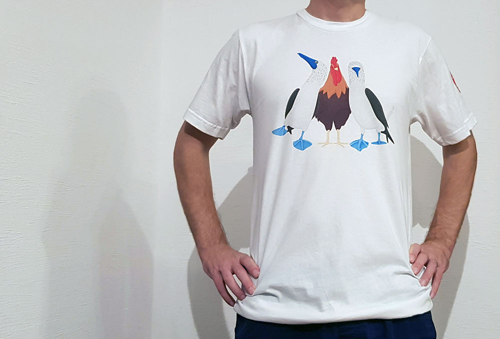
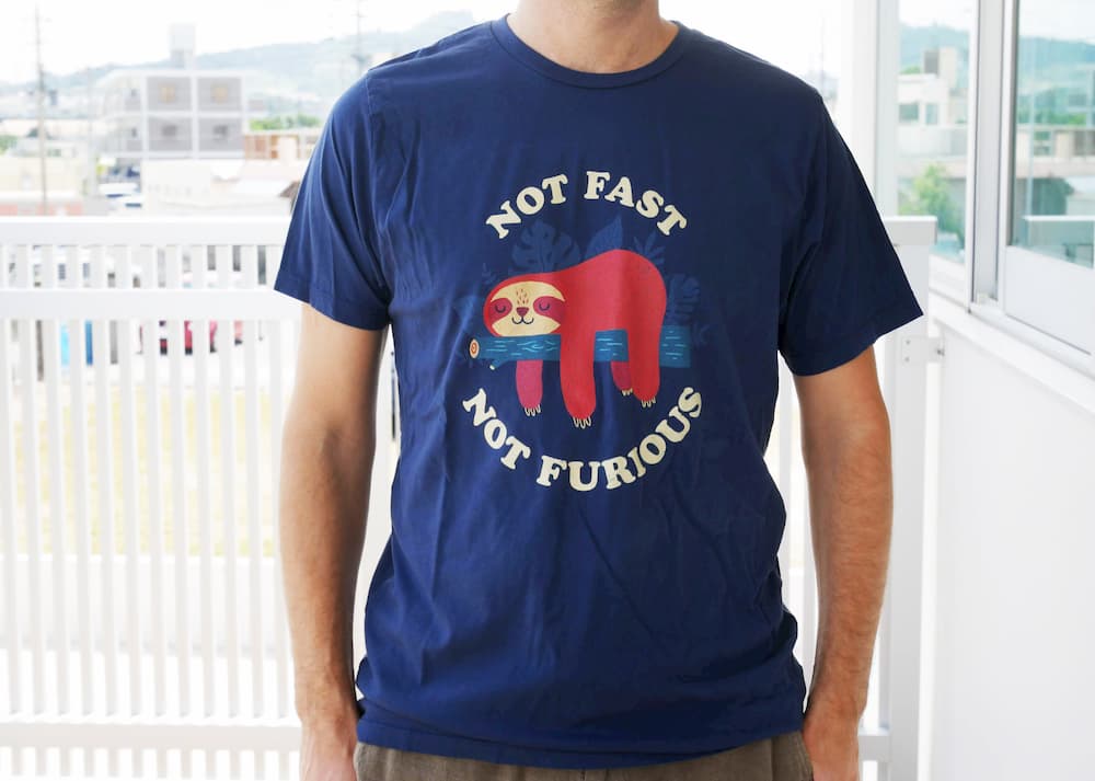
Sloppy Octopus is an online t-shirt store started by Anthony Perry in New Orleans, Louisiana, USA. Sloppy Octopus sells original and unique designs that cannot be found anywhere else. Sloppy Octopus opened its virtual doors in 2019. They specialize in designs oozing sexual innuendo but branch out into topical subjects like the current COVID-19 crisis, all the while keeping it light and humorous. Be sure to check out the Sloppy Octopus t-shirt review as well as the Sloppy Octopus site review below.
Logo
The Sloppy Octopus logo is one of my favorite things about this site. I would remove the “.com” but otherwise, I wouldn’t change a thing about it. I like the colors, the name, and the cute little sloppy octopus mascot. I don’t know where this character came from or what his connection is to t-shirts but it is fun, funny, and ridiculous. Maybe that’s the point.
Site Design
The homepage is a bit of a mess. The logo is a little too large and while the text to the right might have some SEO benefits and tells us what the site is about, it looks cheap and dated.

Because I think the logo is cute and has impact, I would center it on the homepage and move the text to another part of the page but reduce the size by about 30%. On mobile, it is centered but far too big. You need to scroll down to see what Sloppy Octopus has to offer. Actually, this is a header area for the whole site, which means you have to scroll down to see the focus of every single page on the site. That’s not ideal.
I would save the logo for the homepage only and then use the same font and colors in a simple bar across the top of the site for every other page. I think that would be enough to retain branding. Or perhaps just use a reduced size logo featuring only the mascot.
The homepage has an image slideshow which is a feature that many people think is a waste of time and space. I’m of mixed opinions about them. Probably because despite reading convincing arguments saying that they are unnecessary distractions, I am probably one of the few people who like to look at them. Still, this slideshow is wasted. It may show you the products that are on offer but it’s not clear what the purpose of it is. Only one of the slides has a link. It is a button that says “Shop Now” which if you click, takes you to the shop page of the site. I think it would have been much better if the button said something like “Buy This T-Shirt” with a link to the actual product page of the t-shirt(s) in the image. All slides should link to a relevant page.
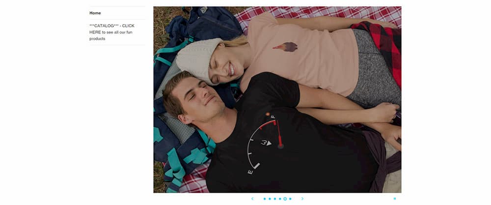
I’m going to harp on about issues I have with the homepage for another bit in this Sloppy Octopus site review so please bear with me. Check out the text in the image above, which is literally a sidebar when it should be the call to action. There is some text asking you to check out the catalog when there should be a prominent button with the words “Shop Now” or something to that effect. If it’s a button people know what to do immediately and you don’t need to tell them to click on it. A big button or large underlined text with the words “See all our fun products” would work too.
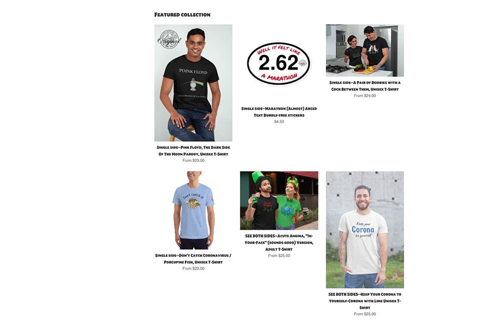
I’m still talking about the homepage but this problem persists in the shop pages. The lack of symmetry makes the store look like it was just thrown together and may make people question the legitimacy of the site. There is no real reason that the images can’t have a consistent size. Having a consistent image style can take quite a bit more effort but I think it’s less important.
I think having the featured products on the homepage is a great idea but I would move them to the top of the page and add the aforementioned call to action directly below. Basically, you will be telling the people visiting your site that if you like these products you’ll probably want to see more.
Below the featured image there is some text about their “front and back joke” t-shirts. That’s great but there should be some images to go with that text instead of a seemingly random picture of the sea. It’s a nice picture but I can’t figure out why it’s on the home page.
And below that, there is a video of a “Beautiful young girl in a tight outfit holding a SloppyOctopus.com tote bag”. I don’t see the point of this video and what the relevance of the girl’s outfit is except to get someone to view the video. I think the video could be put to better use. For example, Sloppy Octopus could offer the tote bag for free on orders over a certain amount and you could promote the video as a way to get a free tote bag, like the girl has in the video.

One last point about the homepage and it affects every other page too and that is the footer links. There is a header for two sets of links but there is only one list. I would either split the list or use the second column for something else like social media.

The product page, apart from the header and footer issues mentioned above, is well laid out and easy to understand. It might have all the information you would need to help you make the purchase on the page. It also has nice big clear images. That sidebar needs to be removed or improved, though.
Product Images
The images are a mix of mockups and actual product shots. They are all quite well done and if you can put aside the lack of standardization (which I find difficult to do), you can’t complain. I would probably use the mockups as the standard thumbnails and use the photo shots for featured images, banners, header images, and social media.
Also, for the “front and back” t-shirts I would try to show both sides in the first image. You don’t need to make your customers work.
The T-Shirts
Sloppy Octopus sells more than just t-shirts but as the Shirt List is a t-shirt website, I will focus on their t-shirt selection. I don’t want to hurt anyone’s feelings in this Sloppy Octopus site review but I think it’s important to give an honest opinion. So I’ll be frank here and admit that I didn’t find any t-shirt that I would be interested in buying. I know I’m not the target market but despite the reasonably large selection of t-shirts in the store, I only found one funny enough to make me smile (the Corona t-shirt).
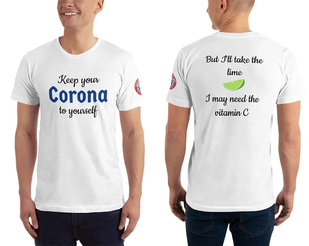
Most of the t-shirts are “front and back joke” t-shirts. The idea is that you should be shocked (or at least drawn in) by the front of the t-shirt and feel compelled to look at the back of the t-shirt. I did look at the “punchline” on the back but my reaction was either confusion or just to say “Oh” to myself. The following t-shirt is a single side t-shirt but I think it summed up the humor well for this site.
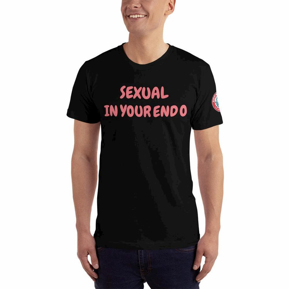
Most of the “jokes” are quite puerile. I feel they are joke ideas that a 13-year old budding comedian might think of during a brainstorming session and then discard because they are simply not that funny. I would like to reiterate that I am not the target market but I am not really sure who would be interested in most of these shirts.

Here’s an example of one of the cleaner shirts on the site, that I might wear if it were given to me, even if I wouldn’t purchase it myself. I like t-shirts with simple designs. I like green t-shirts. I’m Irish. You might think it was made for me. But even though I get the joke (it’s an old one), and I understand why it’s funny, I don’t think it’s funny enough to put on a t-shirt. Perhaps if my name were Patrick Fitzgerald or Gerald Fitzpatrick… The Paddy O’Furniture t-shirts are a class above.
I was going to post some more t-shirts here but as the artwork/design doesn’t really contribute anything, I’ll just post a sample of the “jokes”, instead.
Front: Hello. My name is Tat.
Back: I believe in tit for tat.
Front: Uranus
Back: Next door to heaven
Front: I likey gurls.
Back: Sorrry for the misspelling, it should be “Licky”.
Front: 1 (In very large font)
Back: Have you ever seen 1 so big?
I don’t know know what else to say about them really. Let’s move on.
Oh, I don’t know if all the t-shirts are American apparel but the one I received to review was indeed American Apparel so the t-shirt fabric quality is pretty good.
Shopping Cart
Sloppy Apparel uses Shopify as their storefront and on top of a clean shopping interface and shopping cart interface, there is a variety of payment options.
Navigation
The navigation on Sloppy Octopus is slapdash. The sidebar contains the most important navigation to the store but it is just plain text. There are links at the top for “Log in”, “Sign up” and “Shopping Cart”. I think only the shopping cart link needs to be there. I would categorize the products in the store and then have links in the top navigation. Even if it’s just categories like “T-Shirts” and “Accessories”, it would be helpful.
The bottom navigation contains what it should but the design needs a bit of work. As there is a search bar on the top of every page, I’m not sure that we need a link to a search page.
SEO
They have put a bit of effort into the on-page SEO. There are a lot of keywords and keyphrases on the homepage. They probably need to be refined and strengthened a bit but overall it is a good effort. Even the product pages have lengthy descriptions. Some of the product titles could be shorter. For example this title: “SEE BOTH SIDES–Acute Angina, “In-Your-Face” (sounds good) Version, Adult T-Shirt” might work better as “Acute Angina T-Shirt” or “Funny Acute Angina T-Shirt”.
A blog would help drive traffic to this store. Anthony Perry has a particular sense of humor and perhaps with a blog, he could find like-minded followers who could be converted into customers. If his blog visitors commented, it might also be a source of ideas and/or a critique of existing ideas. The t-shirt market is highly competitive so SEO is a constant struggle. Sloppy Octopus needs to do something to give it an edge over the likes of Redbubble and Cafepress.
Selection and Pricing
There is a decent selection of t-shirts (about 50) all with a similar sense of humor, so if you find one t-shirt you like you will probably find more. Most t-shirts are priced at $25 including shipping so that’s pretty standard.
Social Media
There is a rarely updated Facebook page. I had to Google to find it.
Conclusion
The site itself needs a lot of work regarding layout and design. I’m undecided as to whether it would be worth it because I am still trying to figure out who would buy these t-shirts. I have a Sloppy Octopus t-shirt so I know the fabric quality and the print quality is good but I have to wonder if there is an audience willing to buy this kind of joke t-shirt. Thanks for reading the Sloppy Octopus site review.

